Posted by Rachel Westall on 28 September 2020

The product and style worlds relating to seasonal decorations, festive décor, commercial office supplies, paper for personal use, writing materials and school supplies are becoming ever more closely aligned with global consumer trends. Modern living and working concepts are increasingly blurring the classic boundaries. Sustainability and general mindfulness are increasingly seen as the central themes. They can be found equally in the design of living spaces and home offices, from your favourite café to contemporary office environments, from intimate retreats to the shared festive moments of the year. "The retail industry's role is also evolving: in place of short-lived designs and vast collections, the emphasis is on creating an appropriate, credible and stimulating product mix. Innovative concept stores and creative retailers provide successful examples of this on every continent," confirms designer Claudia Herke. Hip stores all over the world are providing a mix of offers: new and second hand merchandise, fashion, flowers, decoration, stationery, a café, well-being, work - everything is presented in a unified way. But only through a curated selection does it mirror a new, more mindful lifestyle that appeals to customers.

The three common style worlds show the themes, colours, materials, inspirations and styles for the coming season.
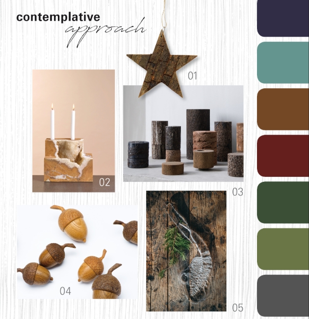
'Contemplative approach' - nature as a source of inspiration
In this style world, the material takes pride of place in the design. Renewable materials such as cork, bark, jute, grass and wood determine the unpretentious look together with metal, marble and stone. The materials remain in their natural state, are roughly hewn, broken, woven or rudimentarily processed. The tactile feel is important. So in addition to the rustic surfaces, finely polished, hand-caressing finishes emphasize the beauty of nature. Old craftsmanship is being revived. With seasonal decorations, clay and ceramics with a rough, sandy appearance look genuine and natural. The forest provides an abundance of designs and motifs, including acorns, bark, leaves, nuts, cones and fruits.
The colour palette emphasises the restrained mood and the tactile materials - these include dark juniper berry, light green, fawn brown, red beech, matt green, moss, basalt green and a warm, light stone shade. The individual tones appear deep, rich, almost of plant origin. The characteristic grains and patterns of the natural materials complement the harmonious picture.

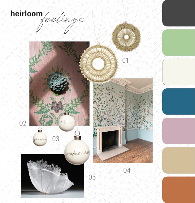
This poetic, young style opens up an optimistic perspective. Numerous artistic and playful aspects can be discovered in the design, including more down-to-earth interpretations in delicate hues. The cheerful, lively flora is striking. Blossoms, scattered flowers, mille fleur and vines sprout alongside frills, fine graphic designs, necktie and chequered patterns. The numerous romantic tapestries are in the foreground here as quotations from a golden era. The joy of adorning is reflected in every aspect of the product and of life: from festive decorations, gift wrapping papers and greeting cards to stylish working and writing.
The colour range combines sensitive, optimistic tones. The palette extends from a velvety mouse-grey, delicate lime green, cloudy white and dark topaz to a romantic shade of rose, from light almond to a red tone and soft, airy sky blue. The materials reflect the refined composure: porcelain, glass, fine papers, handmade objects and surprising new interpretations of old craftsmanship. This is complemented by the delicate interplay of transparency, gold and brass lustre.

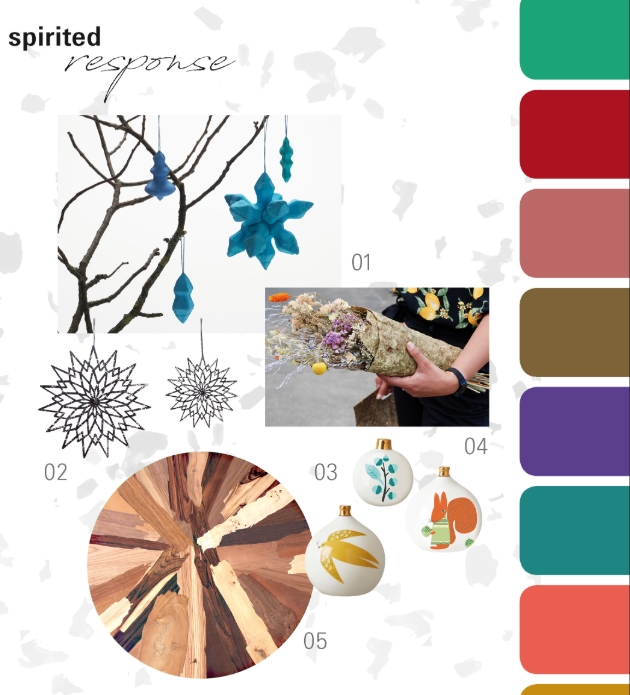
Not a trend, but a necessity. This style world presents attractive alternatives and unconventional solutions that focus on zero waste, a circular economy and up & recycling. Here the emphasis shifts to the arrangement of the home office for job and school. The design is handcrafted, creative, cheerful, colourful and uncomplicated. Organic forms and eye-catching, illustrative designs reminiscent of the '60s have a strong impact. Hand written or drawn print motifs, childlike sketches and ideas with an improvisational character round off the original style.
spirited response shows a vibrant combination of everyday work and festive decorations. The colour palette combines vivid shades with random melanges that result from different recycling processes. Paper waste is transformed into papier-mâché, and old fabrics or cords become creative materials for new objects. Contrasting scrap wood combines to form striking eye-catchers, and flower waste is used to create unusual papers and gift packaging. The colours generate positive energy. Their range extends from intense sea green, fiery red, faded rose and a milky caramel brown to ultraviolet, Bristol Blue, bright flamingo orange and corn yellow.
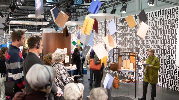
The Christmasworld and Paperworld Trends are the first point of contact and the most important source of inspiration for retailers. They offer concrete assistance in placing orders along with helpful guidelines for a modern and simultaneously high-turnover product range and for the presentation of merchandise. Designers Claudia Herke, Cem Bora and Annetta Palmisano from the bora.herke.palmisano style agency base their trend forecasts on the latest currents in fashion, society and interior design.
In view of the current situation caused by the Covid-19 pandemic and the associated international travel restrictions, Messe Frankfurt has decided to cancel the coming edition of Creativeworld and, for 2021 only, to offer it as in digital format within the framework of the Consumer Goods Digital Days from 17th to 20th April, 2021.
As a special exception, the team will bring together Christmasworld, Paperworld and Ambiente under the heading International Consumer Goods Show – Special Edition from 17th to 20th April, 2021. This physical event will be supplemented for the first time by the digital programme of the Consumer Goods Digital Days, which will also host the purely digital offers of Creativeworld.
Visit https://creativeworld.messefrankfurt.com/frankfurt/en.html for further information.